Manana Interactive


Manana Interactive
Manana Interactive has built an evidence-backed self-regulation training game powered by the user’s breath that gives them the tools to become more emotionally aware and in control of their state.
Using a chest-strap heart-rate sensor, players regulate their emotions by slowing their breathing to lower their heart rate and progress in the game.
The goal of this project is to enhance game experience, player engagement and retention, improving the overall sales experience to communicate customer value.

Problem
Issues were identified during a playtest of the existing design.
The overall visual presentation was not sufficiently engaging to generate excitement among players, the user interface required refinement, and the performance feedback screens were unclear and difficult for younger players to understand.
Solutions
-
Improve the UI elements and surrounding screens with the goal of increasing motivation and retention.
-
Redesign the performance feedback screens that present data in a clearer, more age-appropriate manner to better support younger players’ understanding.
Constraints
-
Designs must match the established gameplay theme.
-
They must be suitable for target end users (children aged 9 to 12).
-
Accessibility compliance (WCAG 2.2)
-
Limited timeframe


To achieve the most effective game screen designs, it was essential to understand the business objectives, the information required to be communicated on each screen, relevant competitor approaches, and how the existing UI across the game aligns with heuristic evaluation principles to support clear navigation and a seamless user flow.
Gamification, reward mechanism & feedback loop
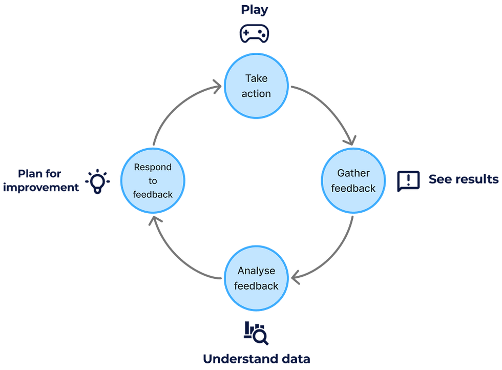
The early stage of research phase focused on gamification, particularly reward systems and feedback loops that encourage learning and sustained engagement.
A key insight was the importance of intrinsic motivation—designing experiences that players want to engage with voluntarily rather than relying solely on external rewards.
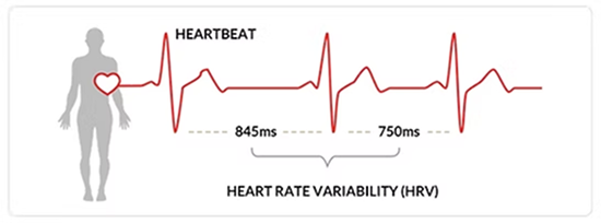
Biofeedback training & heart rate variability

The company’s biofeedback training game is driven by the player’s breathing through a chest-strap heart-rate sensor, with the results screen presenting heart rate variability (HRV) data.
To design game screens that communicate this information in a manner that children aged 9 to 12 can easily understand and use constructively, it was essential to develop a clear understanding of what HRV is, how it functions, and how the data can be effectively visualised.
Competitor analysis
I conducted a brief competitive analysis of similar products with overlapping audiences. While many competitors targeted younger children, our challenge was to strike a balance between simplicity and maturity, ensuring results were easy to understand without feeling overly juvenile.

Visual concept
I also reviewed other space-themed games for inspiration on what it is about these that bring out the space vibe, how their surrounding screens are cohesive with the actual gameplay, and evaluated their UI layouts using heuristic principles to understand how visual hierarchy and information placement supported usability.


The pre-designed screens presented before and after gameplay required refinement. In particular, the game’s title screen and end-of-game results screens were redesigned to be more visually engaging while remaining consistent with the established 2D space theme. This updated visual language was then applied across the remaining screens to ensure a cohesive and unified user experience.

Ideation
With some ideation, I established the initial visual tone through the title screen and level completion screen, which needed to present key information clearly while encouraging replay and improvement.

The established visual tone was then applied consistently across the surrounding screens that guide users into the game, as well as the screens displayed upon game completion.

Following initial feedback, I recognised that I had moved too quickly into implementation, and the visuals needed to be more closely aligned with the in-game theme for that cohesive experience.

-
Designs must match the established gameplay theme.
-
A wider variety to be explored before implementation.
-
Must maintain cohesion across other screens.
The next challenge was to further refine the design to achieve a more innovative visual approach, while consistently maintaining the gameplay theme across all screens to ensure a cohesive user experience. A new visual tone was to be established once again through the title screen and level completion screen.

Improvements
The ideation phase was revisited, drawing inspiration from a range of existing game title screens. Multiple concepts were explored, and elements from the most promising ideas were refined and combined to produce a title screen that met the team’s expectations.

The results screen proved especially complex due to the amount of information and navigation required, leading to multiple wireframe iterations before settling on a solution that balanced clarity and functionality.


A broad range of approaches were explored for presenting information on the results screen. Ongoing discussions with the team focused on prioritising key data, determining the most effective layout, evaluating overlay concepts, considering additional pages, and deciding whether a vertical or horizontal performance bar would be most appropriate.

The new established visual tone was reapplied across the surrounding screens.

As the project progressed, new constraints emerged due to upcoming demos and shortened development timelines. To support implementation, I up-skilled in Unity and became familiar with the team’s GitHub workflow, allowing me to assist with transferring designs from Figma into the game engine.

Due to feasibility and time limitations, the designs were simplified to ensure a stable and deliverable build. The final outcome represents a middle ground that preserves the intended visual direction while remaining achievable within the constraints.


Outcome & next steps
The final designs are significantly more visually engaging than the previous iterations. A consistent visual style across all screens delivers a cohesive experience that aligns seamlessly with the gameplay, while the simplified data presentation enables clearer understanding for players.

The next steps involve further enhancing the visual design in future versions and introducing reward mechanisms, such as badges, to improve player retention. These improvements will be implemented incrementally as additional demos are conducted.