
.png)
Z Energy
(Case study)
PROJECT OVERVIEW
Z Energy is a major New Zealand fuel distributor, offering high-quality fuel options alongside convenience retail services at its stations. The company is committed to delivering exceptional service and innovative solutions to meet the evolving needs of its customers, aiming to be the preferred choice for fuel and on-the-go purchases.

Problem
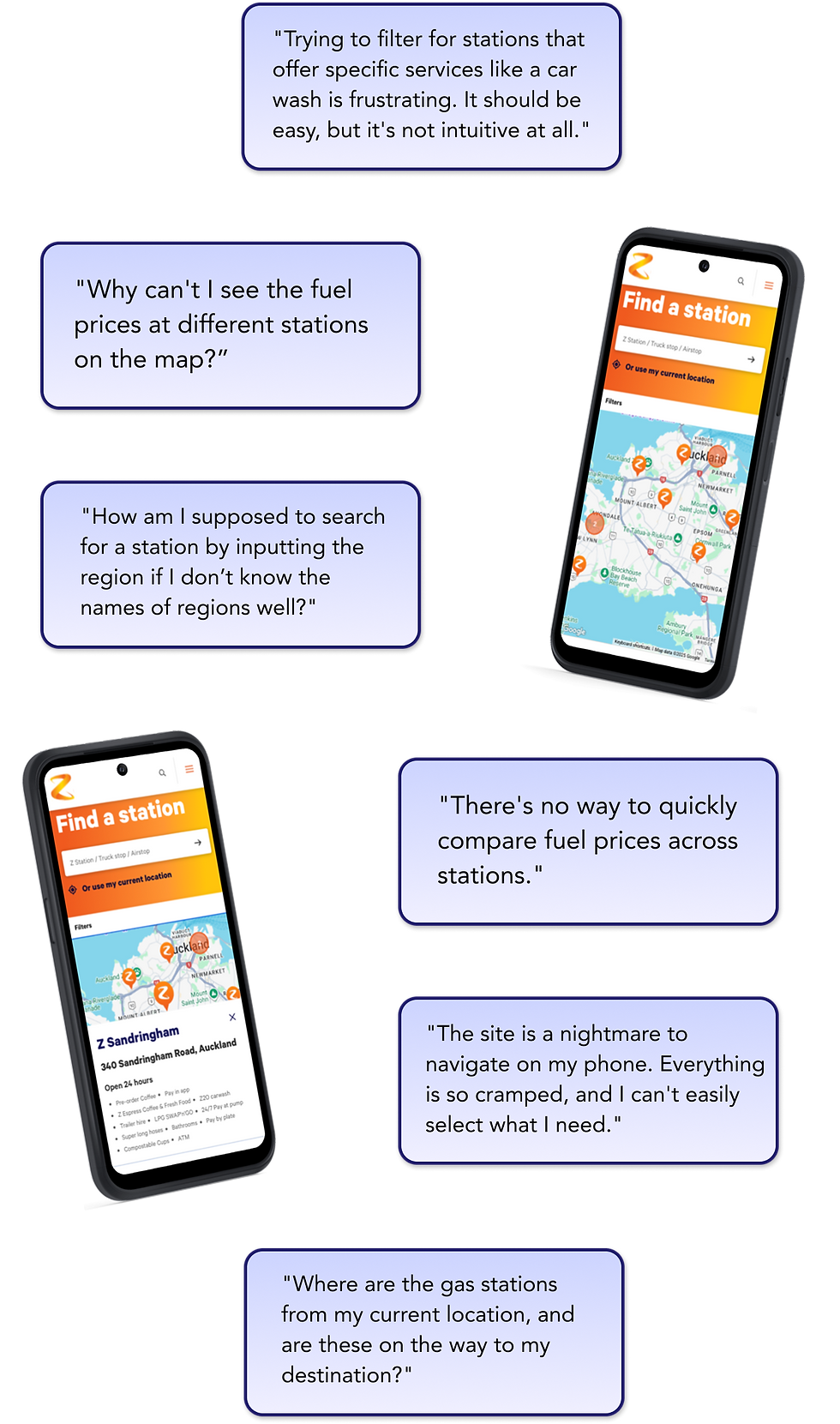
Alex, a road trip enthusiast and freelance photographer, travels across New Zealand to capture landscapes. To plan trips, Alex uses the Z Energy website to locate gas stations and check fuel prices. However, Alex struggles with the station locator and fuel price features.
Solutions
-
Redesign Z Energy’s station locator and fuel price pages.
-
Improve navigation, filtering, and visibility of fuel prices.
-
Add a clear and easy way to compare station prices.
-
Build a Figma prototype that demonstrates the process and solutions.
-
Highlight innovative features for a seamless, informative user experience.
RESEARCH
User persona & Journey map
In order to clearly identify the user needs and pain points, the team produced a user persona and a user journey map. These helped the designers empathise and understand the specific issues from the user’s perspective.


Several issues with the current mobile website and user pain points were highlighted during this phase.

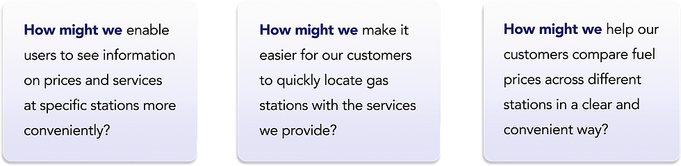
Problem statement, User stories, HMWs
With the information gathered from our user research, our next step was to define the main issues to address, specifying and prioritising tasks that can solve the user problems.


PROCESS
Competitor analysis
To begin our ideate phase, competitor analyses were conducted for inspiration on how to improve the current Z Energy website.

Competitors share strengths in clear station locators, effective navigation, and accessible filter or search tools, yet they lack live fuel prices, station comparison.
Ideation
The team ran an ideation session creating Crazy 8’s, and also gathered sticky notes (Miro) on ideas that address the How Might We statements.

Some of the more promising and feasible ideas (given the time constraints) were selected to improve the website experience.
User flow
The team arranged the selected ideas and thought about required pages to complete tasks on the mobile website. A user flow chart was created to organise the pages that were later prototyped.

Low-fidelity wireframes
Following on from the user flow, low-fidelity wireframes were created and pages were connected on Figma as an MVP for users to complete required tasks.

Usability tests
We conducted usability test sessions to investigate the functionality of our low-fidelity prototype, which helped us understand how easily participants can complete given tasks, which features are working well with the users, and which features need improvement.

Our team ran usability tests with five participants, giving them 5-7 tasks to complete. Difficulty of task completion was measured by SEQs (Single Ease Question) and CES (Customer Effort Score).
Overall usability score was recorded with SUS (System Usability Scale).
Results showed that we were heading in the right direction but also there was plenty of room for feature improvement.


Improvements
The results from the usability testing sessions helped the team prioritise changes and improvements to make. We added the improved features to our high-fidelity mockup.


FINAL DESIGN


Outcome & Next steps
Reflecting back on the solutions to the user problems, the team made sure that the main pain points were addressed and that our final design aligned with the requirements from the project briefing.
.png)
Redesigned Z Energy's station locator and fuel price pages.
Improved navigation, filtering, and visibility of fuel prices.
Added a clear and easy way to compare station prices.
Built a Figma prototype that demonstrates the process and solutions.
Highlighted innovative features for a seamless, informative user experience.
Our next steps are to collaborate more closely with developers to discuss feasibility, further modifications, and to stay updated on development progress.